
Guide
Choosing colours & finishes
Colour and finish decide how a piece sits in a room. This guide explains the colour names used on Fernex Lab products, the layer texture and the difference between a screen and the real material.
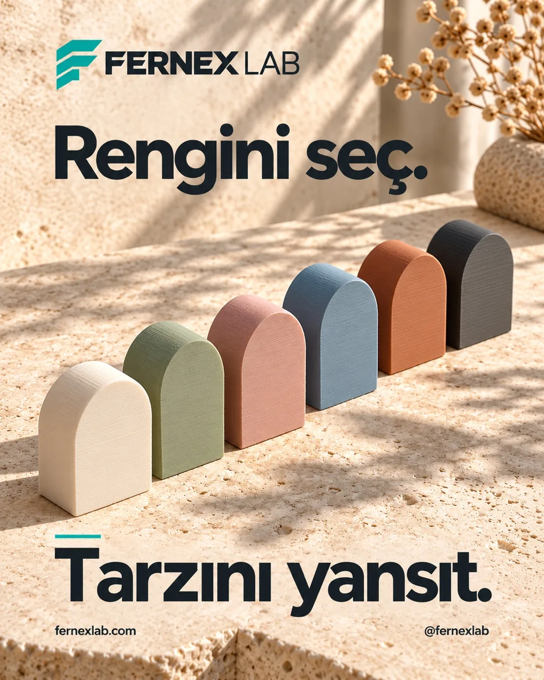
The colour palette
Product pages use names such as cream, sage, graphite, white, terracotta and sky blue. Not every product offers the whole palette; the colours on a product page are the ones valid for that piece. Ask in the conversation about a colour outside the palette.
Matte surface and layer texture
Because pieces are built layer by layer, fine horizontal lines are visible on the surface. This texture is not a defect but the mark of the production method; it reads softer on light colours and more pronounced on dark ones.
Screen versus real colour
Phone and computer screens can show the same colour differently. For a colour you want to be sure about, ask in the conversation for a sample photo taken in daylight.
Which colour where?
Light colours (cream, white) lift small spaces and reflect light; sage and sky blue sit well with wood; graphite and terracotta work as single accents. Keeping to two or three tones in one room usually looks more balanced.